Brand assets.
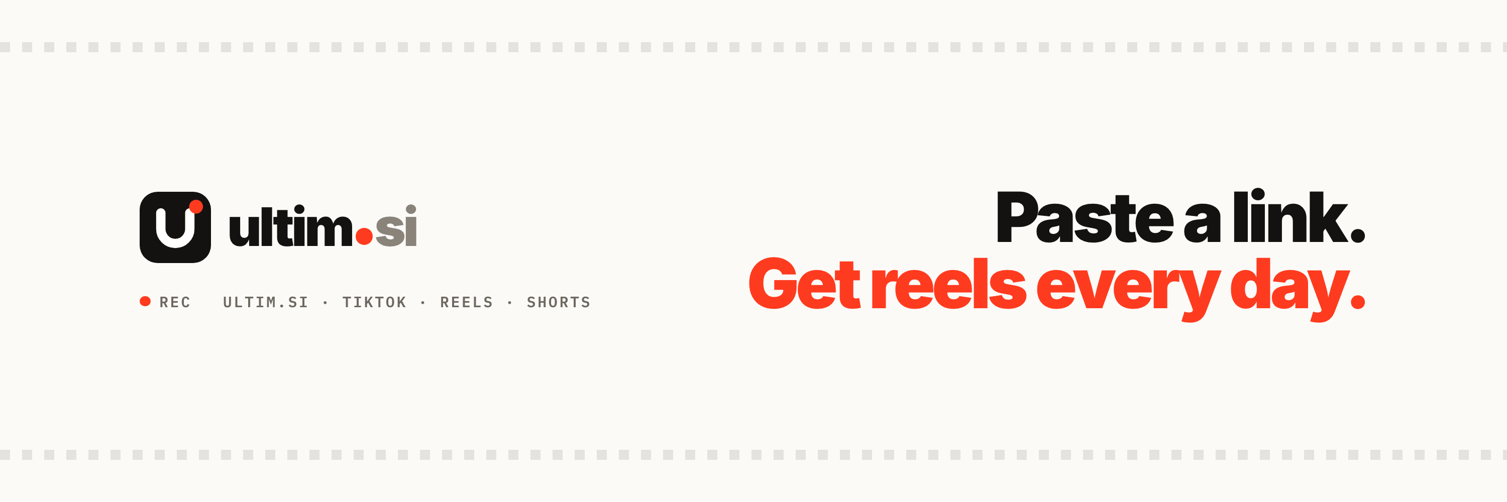
Logos, wordmark, app icons, social banners and the palette of Ultim. Every file is free to use when you write about us; please keep the mark as it is.
The mark.
A bold lowercase u on a rounded tile, with the red REC dot as its tittle. The inverted version goes on photos and dark backgrounds; mono versions are for engraving, print in one colour and embossing.














The wordmark.
Mark plus ultim.si in Inter 900, the domain dot in REC red. SVGs embed the font; PNGs are transparent at 1x, 2x and 4x.














App icon and favicon.
Solid ink tiles for home screens and favicons (the system rounds them) and a rounded 1024 px version with transparent corners.




Social banners.
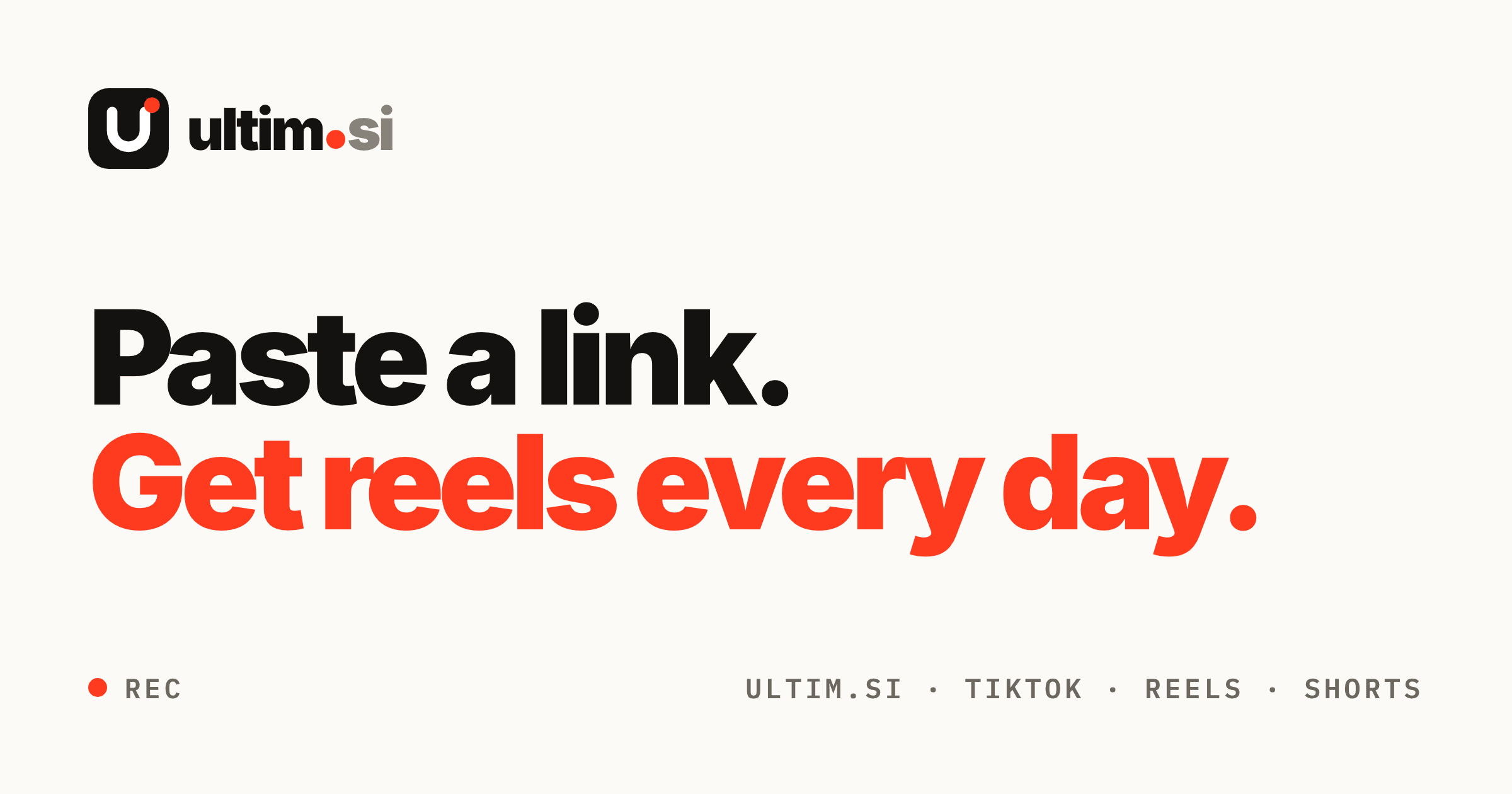
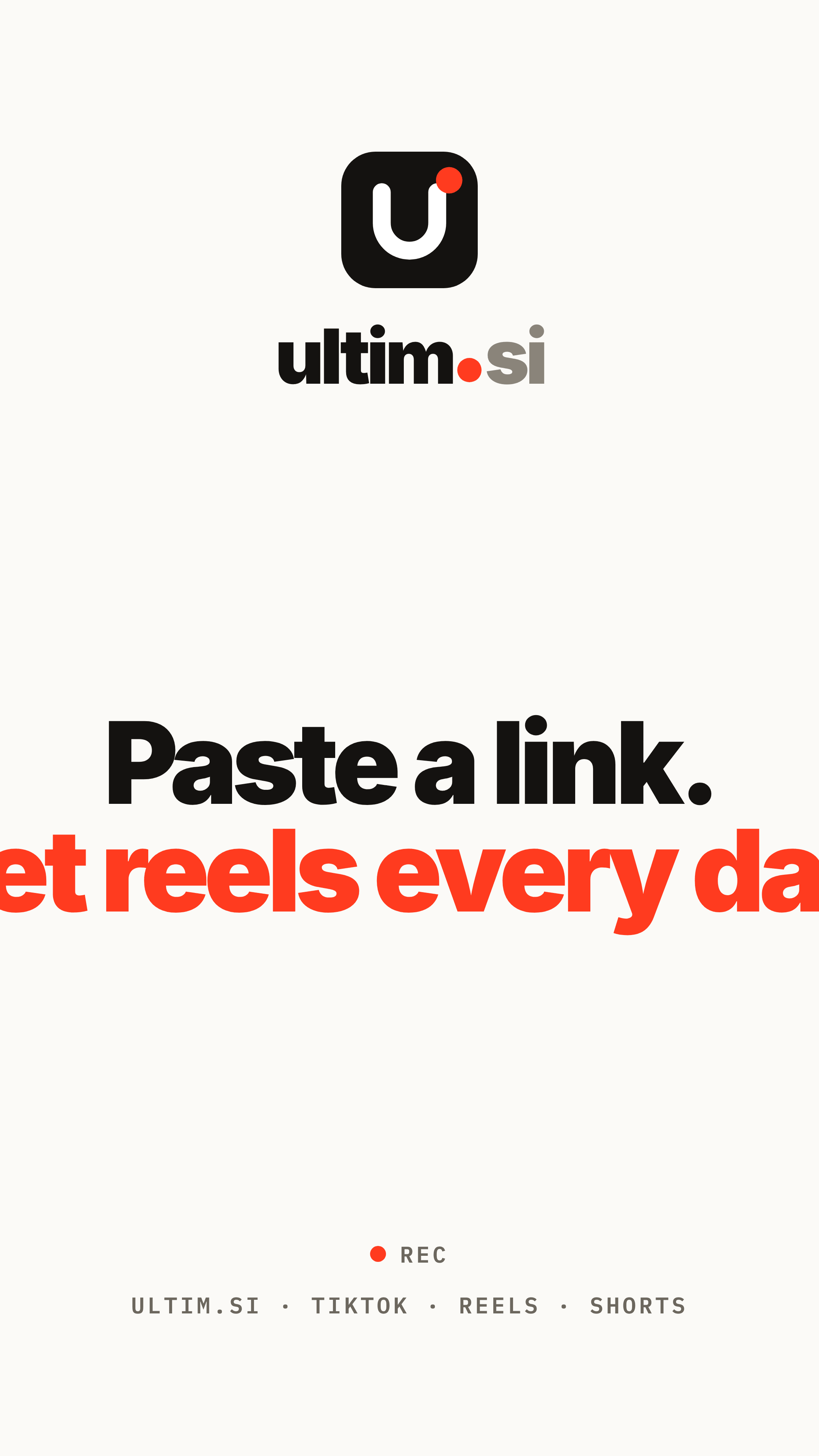
Link previews, headers, covers and a story cover, all at 2x. The YouTube art keeps everything inside the 1546 × 423 safe area.





Colours.
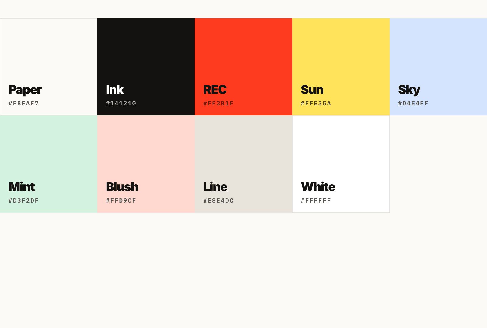
Warm paper, near-black ink and one red accent. Four pastels for panels, never for the mark.
Type.
Two families: Inter for headings and body, IBM Plex Mono for labels. Both are free Google Fonts.
Paste a link.
Inter 900
Tracking -0.045em, leading 0.95. One word in REC red when it earns it.
Your website, turned into reels that post themselves.
Inter 400 / 500
Relaxed line height, ink at 70% for secondary text.
REC · 00:00:12:08
IBM Plex Mono 600
Uppercase, tracking 0.12em. Buttons, captions, timecodes.
How to use it.
A few rules keep the mark recognisable wherever it appears.
Keep a margin around the mark of twice the dot's diameter on every side.
Never show the mark smaller than 24 px; the dot has to stay a visible circle.
Do not recolour the REC dot. In mono versions it takes the single colour, nowhere else.
Scale proportionally. No rotation, outlines, shadows or gradients on the mark.
Use the inverted mark (white tile) on photos and dark backgrounds. The ink mark goes on paper and white.
Red is the only accent in a view. Pastels are for panels, never for the mark or the wordmark.
Need something else?
Write to us for product screenshots, founder photos or a quote.